Overview
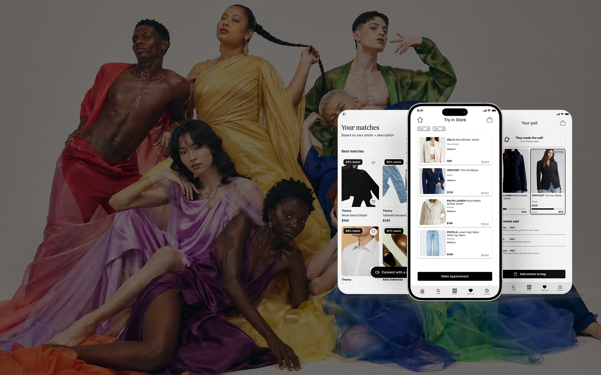
Created as a University of Washington Human Centered Design final project, this experience concept explores how Nordstrom could better support transgender, nonbinary, and gender-nonconforming customers. The work focuses on confidence, privacy, and preparation across digital and in-store shopping.
The Case
Shopping for clothing should feel inclusive and accessible, yet most retail experiences still default to a binary lens that overlooks gender-diverse shoppers.
Inclusive sizing, gender-aware merchandising, shoppable user-generated styling, AI fit assistance, and a smarter fitting-room booking system.
Designing for gender-diverse shoppers supports cultural respect while helping retailers build more thoughtful, inclusive service models.
The Approach
The concept connects personalized discovery, fitting-room planning, and social feedback across one shopping journey.
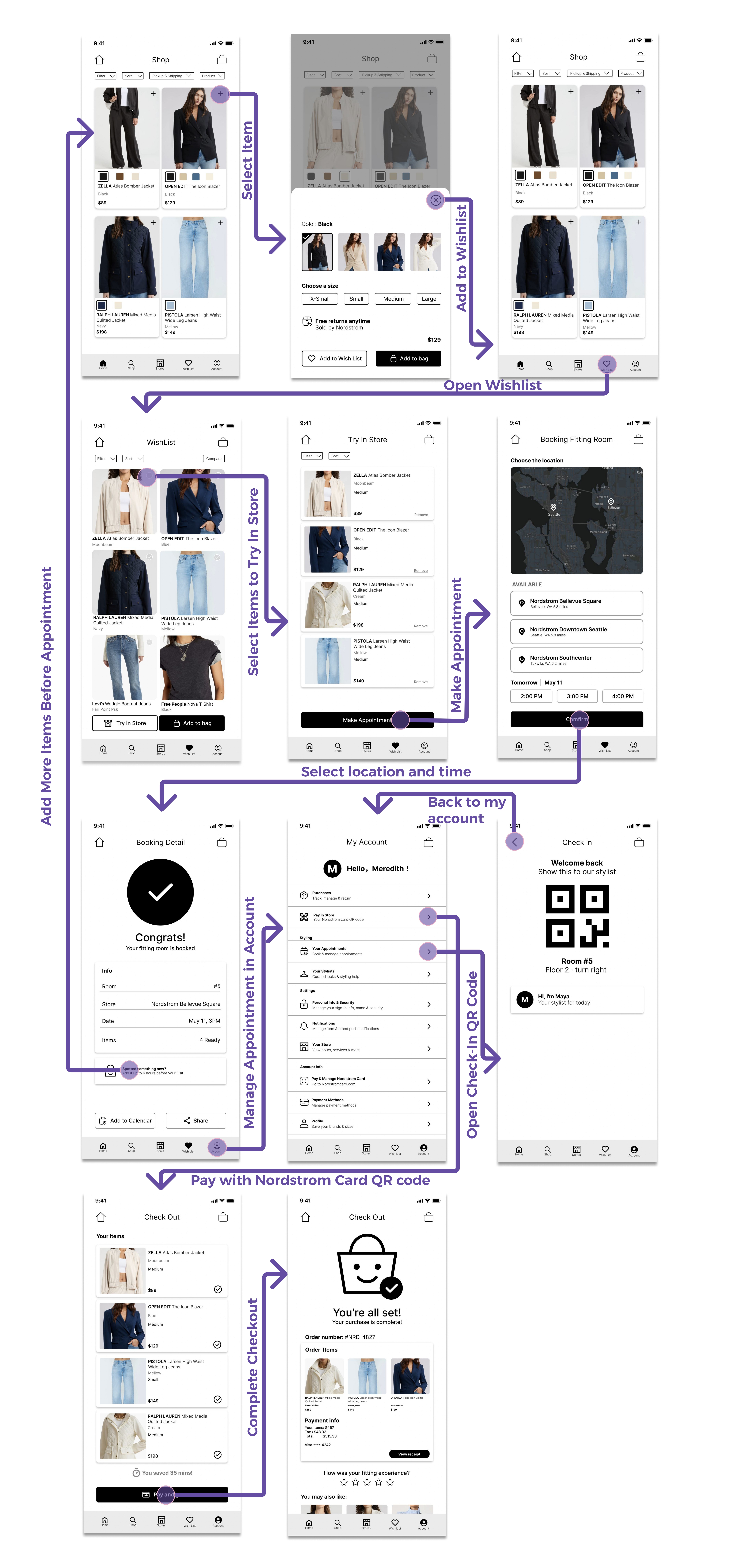
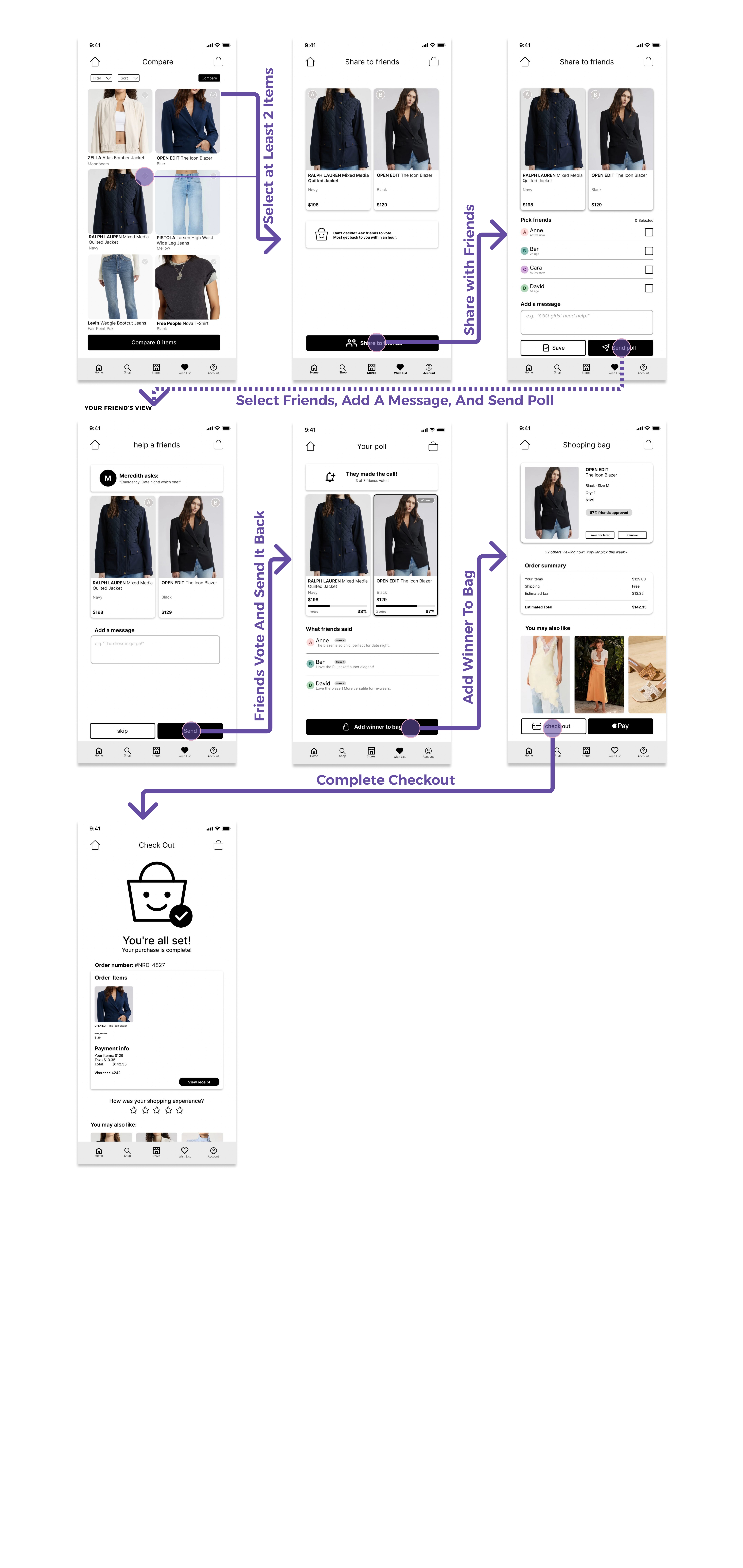
AI-supported styling helps customers explore products with greater confidence, while fitting-room pre-booking and friend voting add privacy, preparation, and reassurance before an in-store visit.
Early Sketches
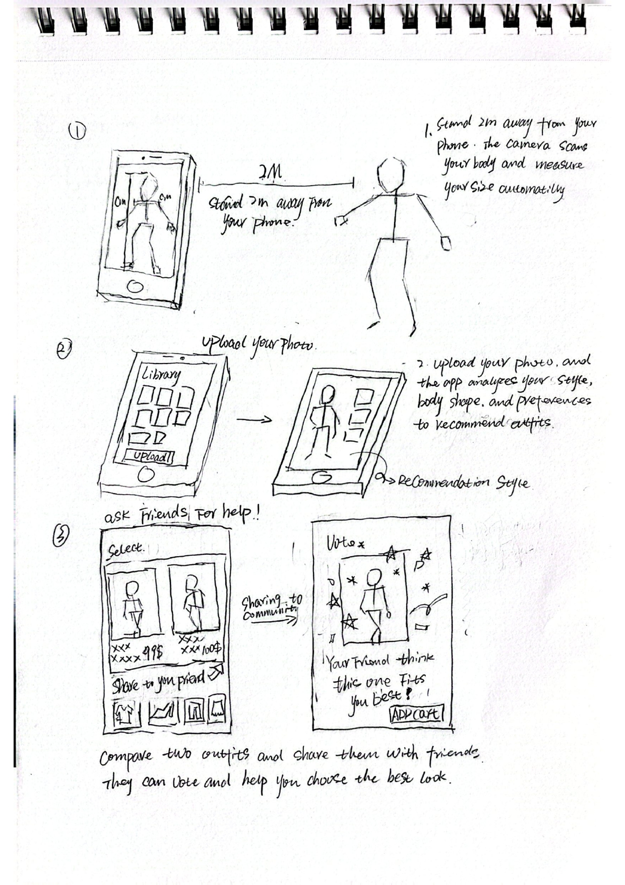
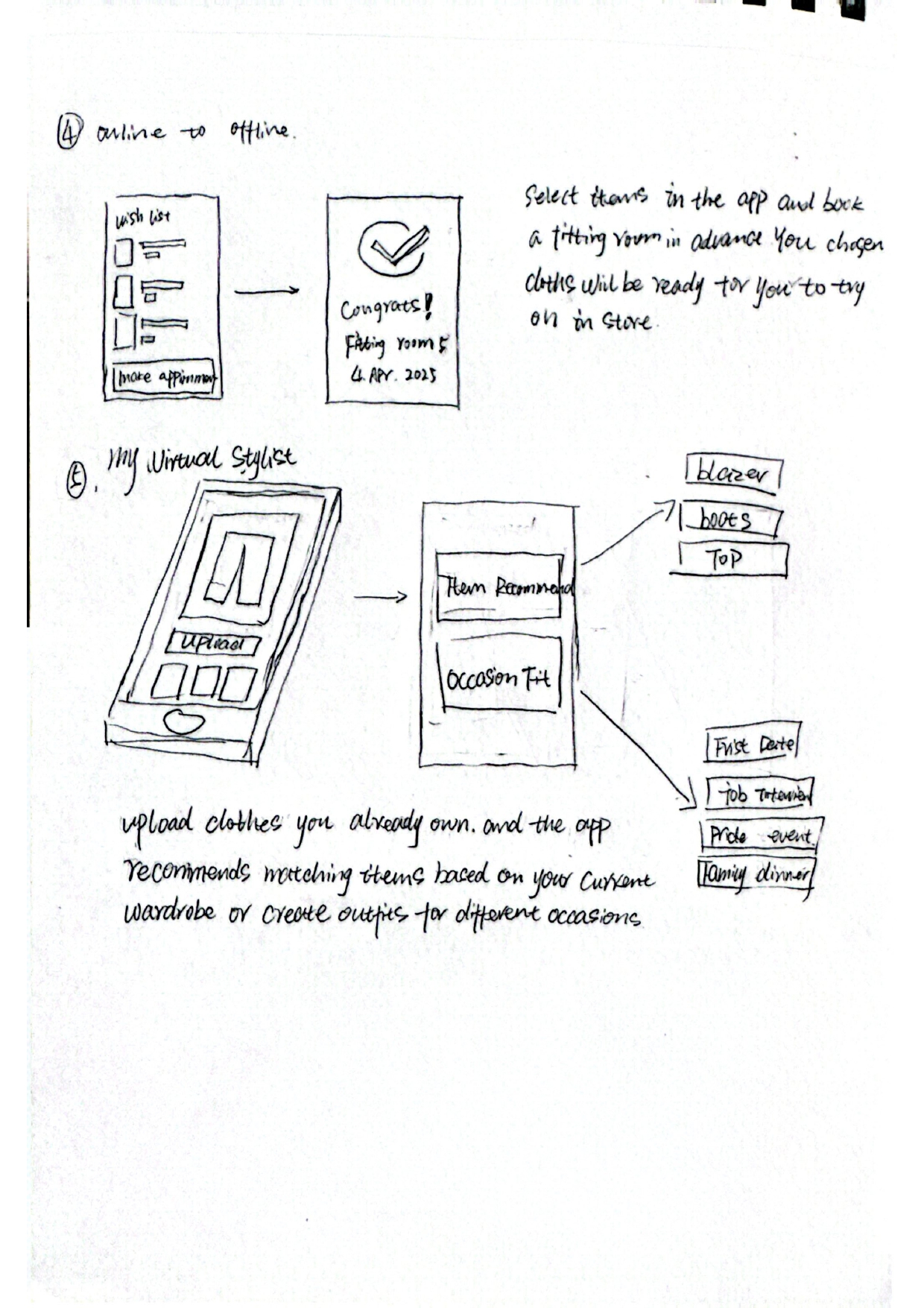
Five concepts explored. We adopted three: photo upload with AI styling, friend voting, and fitting-room pre-booking. We cut two: full-body scanning for privacy reasons and occasion-based closet styling.
Full-body scanning raised privacy concerns.
Photo upload + AI styling.
Friend Voting.
Fitting Room Pre-booking.
Occasion styling, folded into AI stylist.
My Role
Contributed to UX research, experience strategy, user-flow design, visual design, and prototyping for selected features. Worked closely with Vivian as the final project for the Human Centered Design course at the University of Washington.
Key Focus
Designing for gender-diverse shopping needs
Using AI styling to support product discovery
Connecting digital planning with in-store service
Product Tour
Three flagship features explored in the prototype, each addressing a different stage of the shopping journey.
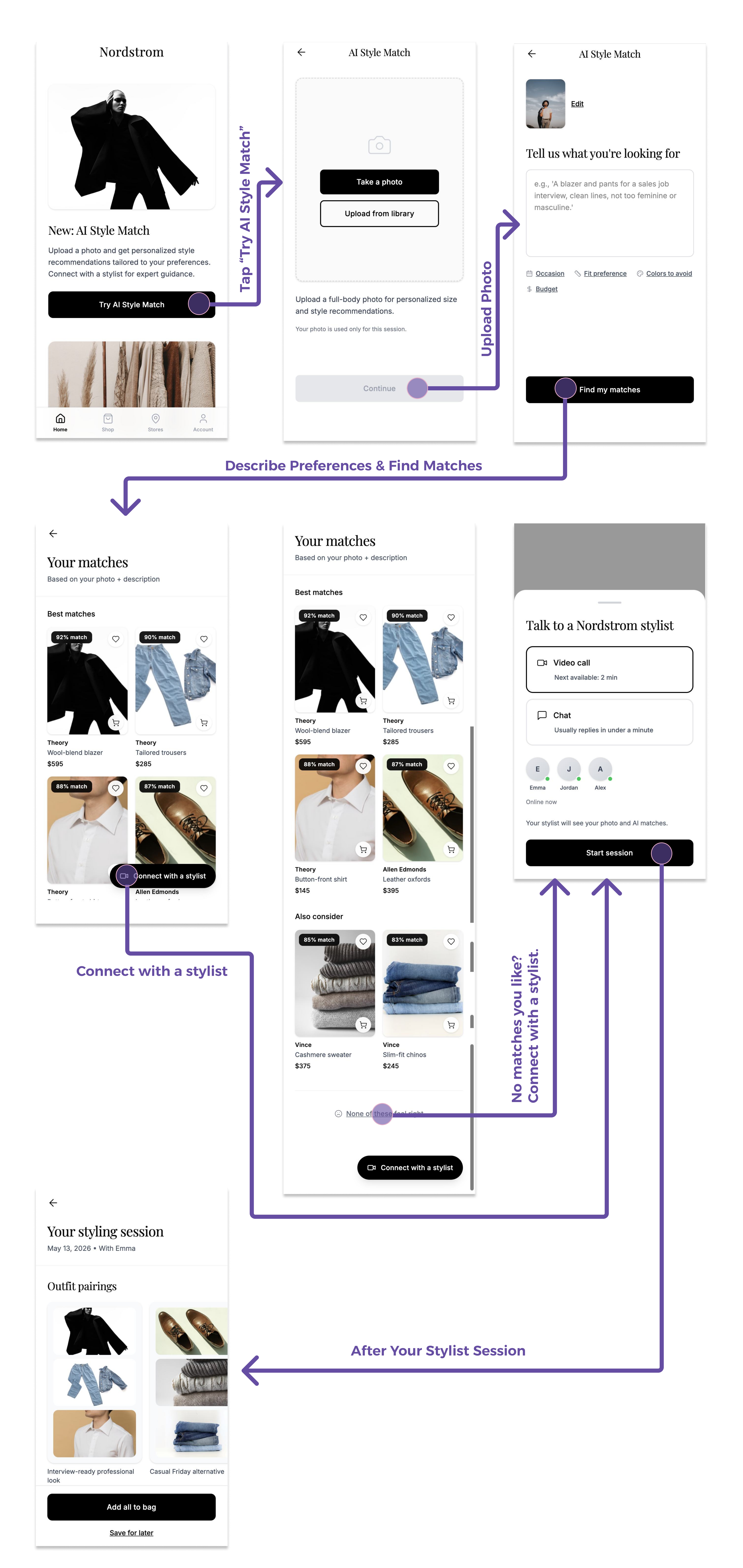
AI Stylist Match + Online Stylist
Personalized discovery that respects identity and style.
Usability + Value
What I Learned
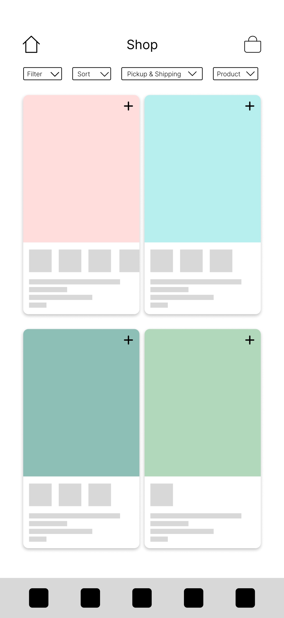
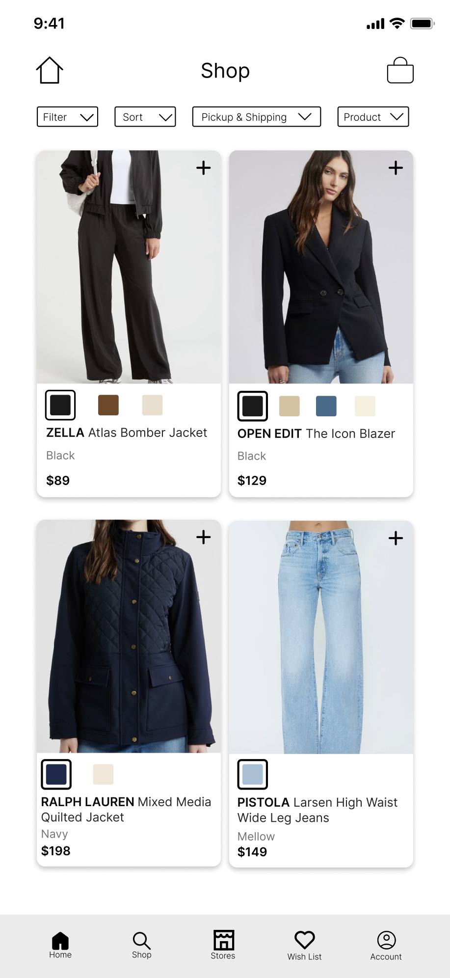
Testing showed that users could not understand a product card when it only used color blocks without an image, name, or price. The lesson was simple: design decisions need to be checked against how users actually read and compare information.
How I Changed It
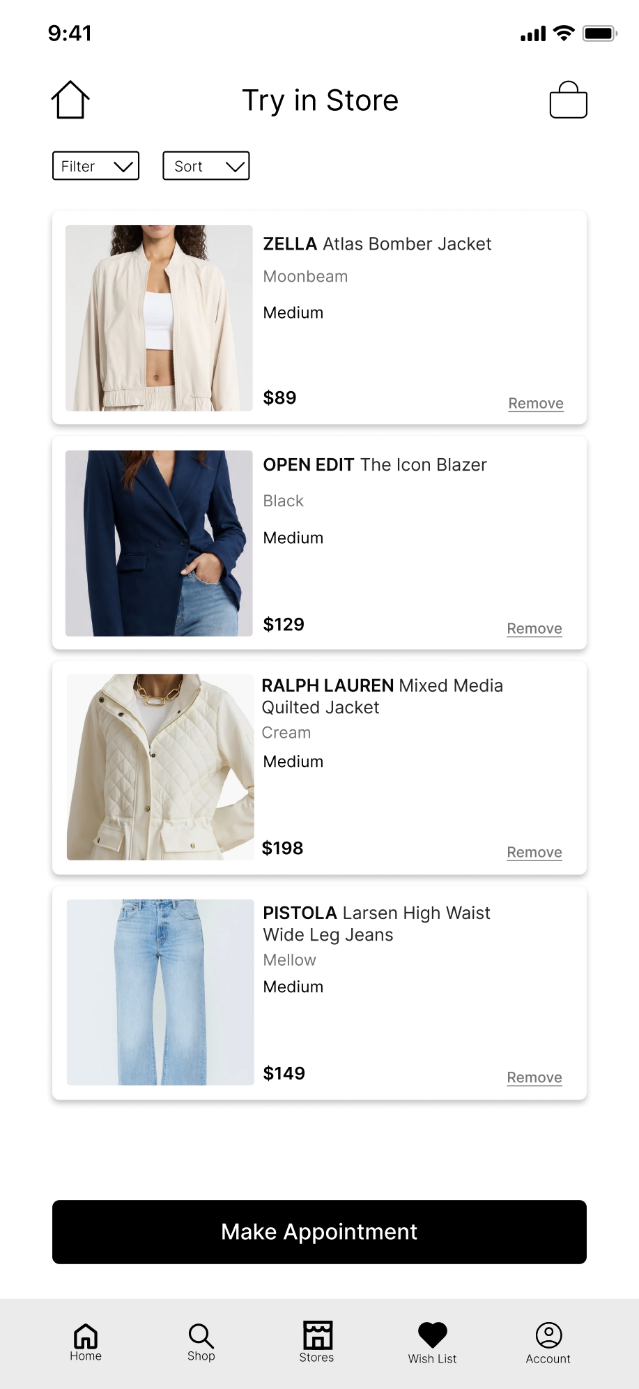
I redesigned the cards to show a real product photo, brand, name, color options, and price so users could recognize and compare items at a glance.
Home Page
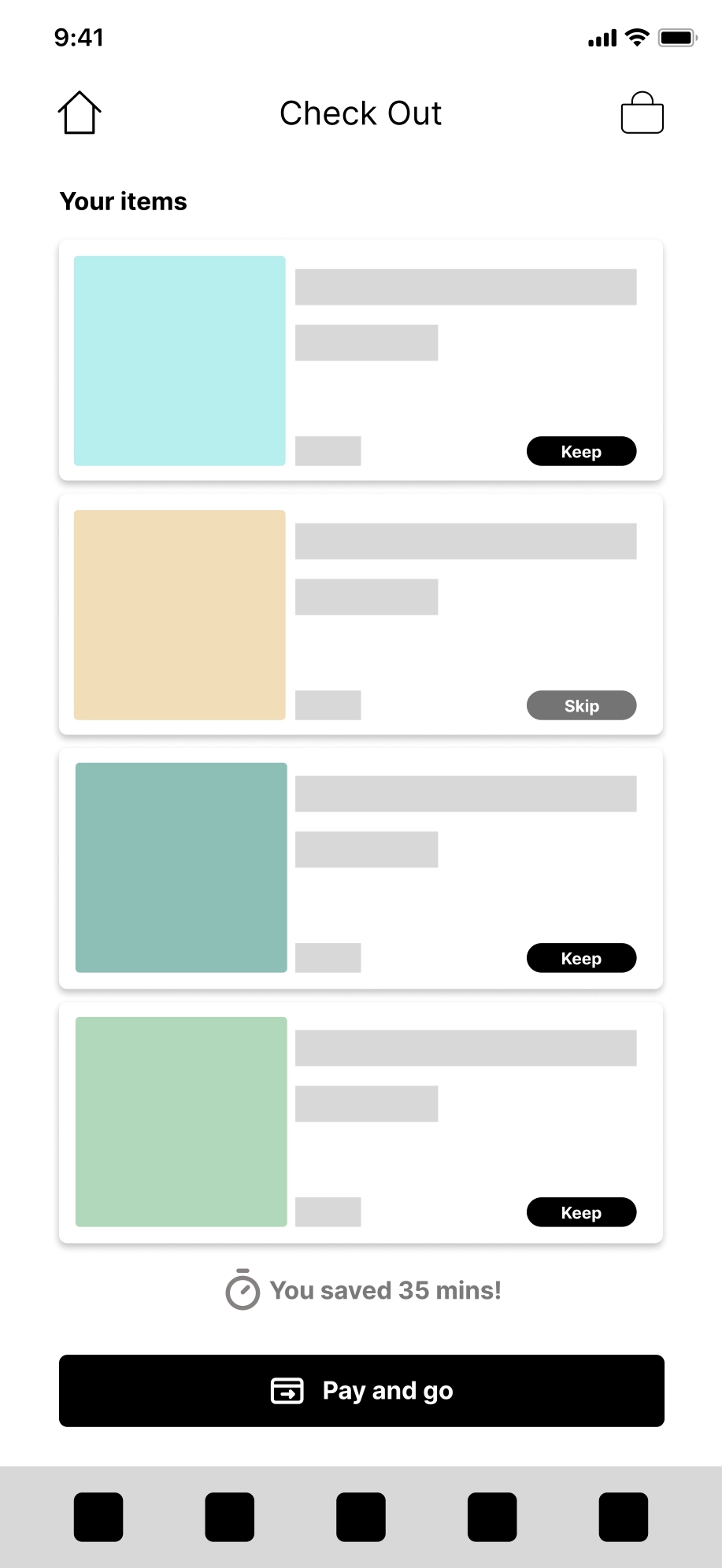
Check Out Page